
Tri-City CDC
Branded Stationery SuiteI partnered with First Media Group to create a cohesive stationery system for Tri-City Community Development Corp—a nonprofit serving Ecorse, Detroit, and River Rouge. The project aimed to deliver simple, bold designs that feel both professional and approachable while staying true to the organization’s community-focused mission.
Deliverables
Design Direction
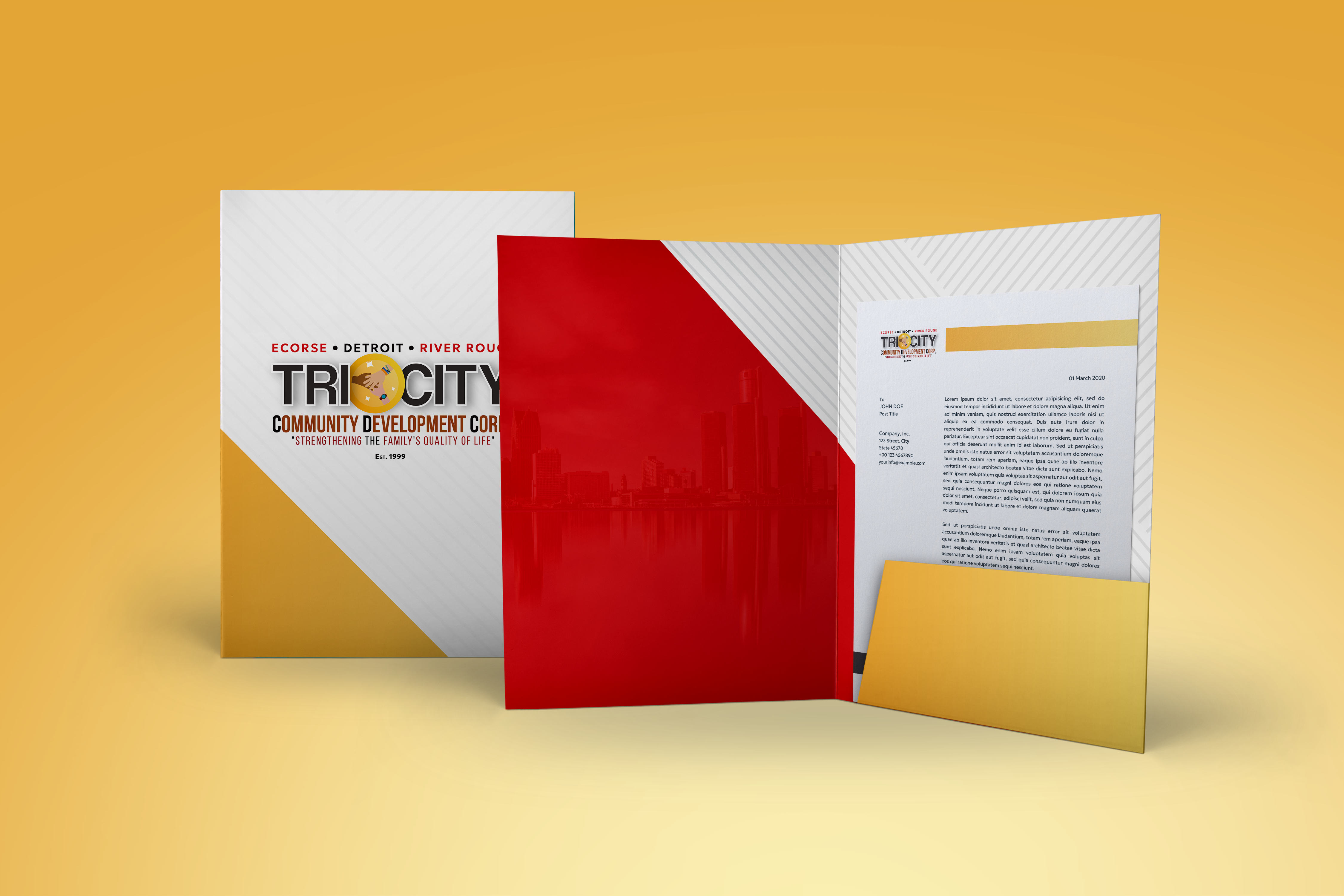
Folder
The folder features a clean geometric layout with Tri-City's logo front and center, accented by a bold gold triangle. Inside, a red pocket overlay reveals a subtle monochrome image of the Detroit skyline—visually tying the design back to the city and its people.
Letterhead
Designed with clarity and structure in mind, the letterhead uses a yellow banner to anchor the top of the page and a footer that brings in essential contact info. The layout works well for both print and digital communications.
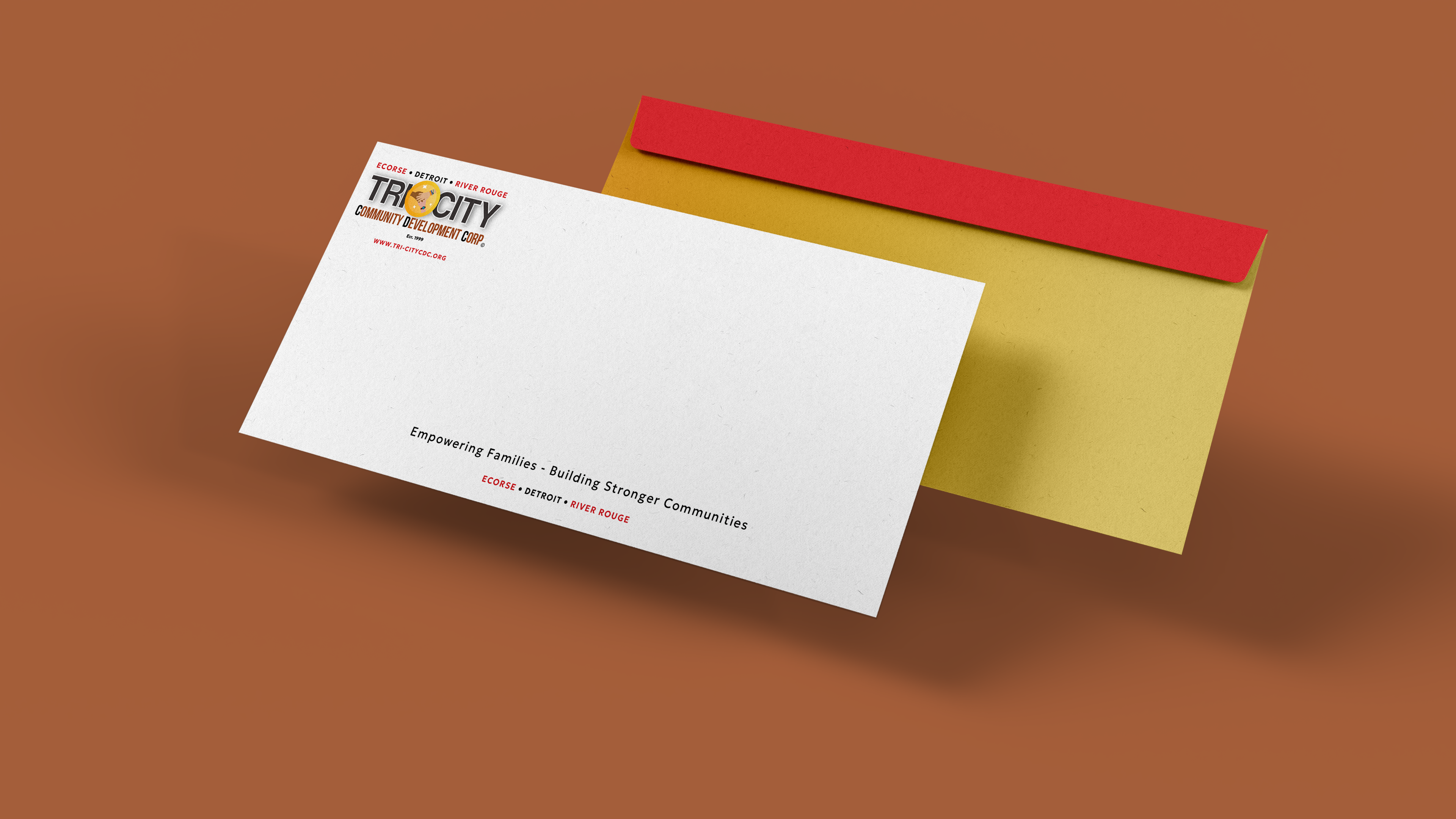
Envelopes
Both the 10x13 and legal-size envelopes highlight the logo and brand message in a minimal, spacious format. The legal-size flap includes a mirrored logo so it reads properly when sealed—a small but thoughtful detail for everyday use.
Impact
This stationery suite gives Tri-City CDC a stronger visual identity across all their printed materials. It’s designed to feel just as professional in a boardroom as it does at a community event—supporting their mission while elevating their brand presence.