
The Power of Prevention – National Conference
Flyer DesignI collaborated with First Media Group to design a series of visual assets for The Power of Prevention, a national conference on substance misuse hosted by the Empowerment Zone Coalition in Detroit. The conference brings together leaders across public health, education, government, philanthropy, and community organizations to advance prevention strategies and strengthen community wellbeing.
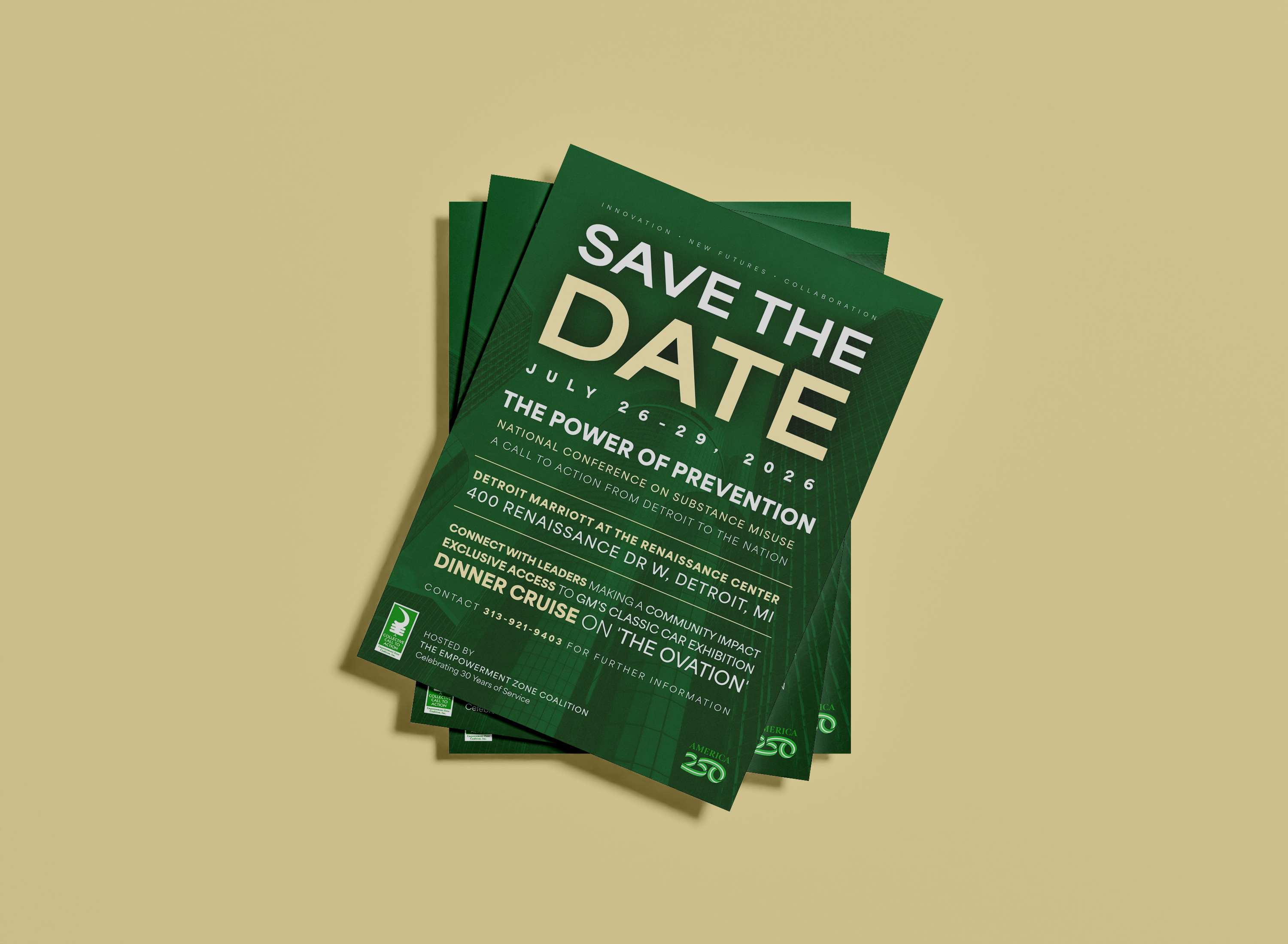
The project began with the design of an electronic Save-the-Date flyer to generate early awareness and establish the conference’s visual identity. As the event planning progressed, the scope expanded to include a comprehensive sponsorship and strategic partnership package as well as event registration graphics for web and mobile platforms.
Together, these materials created a cohesive visual system supporting the conference’s promotion, fundraising efforts, and digital event experience.
![]()
![]()
![]()
The project began with the design of an electronic Save-the-Date flyer to generate early awareness and establish the conference’s visual identity. As the event planning progressed, the scope expanded to include a comprehensive sponsorship and strategic partnership package as well as event registration graphics for web and mobile platforms.
Together, these materials created a cohesive visual system supporting the conference’s promotion, fundraising efforts, and digital event experience.


The Challenge
The conference required a suite of professional materials that could communicate the scale and significance of a national event while remaining accessible and easy to understand for a wide range of audiences.
Key design challenges included:
• Clearly communicating essential conference details for early promotion
• Structuring complex sponsorship tiers and partnership opportunities in a readable format
• Maintaining brand consistency across both print and digital assets
• Highlighting Detroit as both the host city and a symbol of leadership
• Creating a flexible visual foundation that could expand as additional materials were developed closer to the event
Design Approach
The design process focused on establishing a strong visual hierarchy and a cohesive visual identity that could carry across multiple deliverables.
The initial Save-the-Date flyer emphasized clarity and impact, ensuring the event title, location, and dates were immediately recognizable. After early feedback, the design was refined to strengthen the connection to Detroit. Subtle skyline elements were incorporated into the background using controlled opacity, reinforcing the conference’s theme: “A Call to Action from Detroit to the Nation.”
As the project expanded, the same visual language was applied to the Sponsorship & Strategic Partnership Package, a multi-page publication designed to communicate sponsorship investment levels and partnership opportunities for corporate and philanthropic stakeholders. The layout prioritized readability through structured sections, strong typographic hierarchy, and organized tables for sponsorship tiers.
Additional event registration graphics were also created for web and mobile platforms to support the conference’s digital event experience and ensure visual consistency across registration pages and event app interfaces.
Deliverables
• Electronic Save-the-Date conference flyer
• Multi-page Sponsorship & Strategic Partnership Package
• Event registration graphics optimized for web and mobile
• Visual layout system for sponsorship tiers and conference messaging
• Digital promotional assets for early event awareness
Additional conference materials will continue to be developed as the event approaches.
Outcome
The final designs established a cohesive visual identity for The Power of Prevention conference, providing the Empowerment Zone Coalition with professional promotional and fundraising materials that reflect the scale of the event.
The Save-the-Date helped generate early awareness, while the sponsorship package serves as a strategic tool to attract corporate sponsors, foundations, and community partners. Together with the digital registration graphics, these assets form the foundation of a broader visual system supporting the conference’s national outreach and engagement efforts.
The Save-the-Date helped generate early awareness, while the sponsorship package serves as a strategic tool to attract corporate sponsors, foundations, and community partners. Together with the digital registration graphics, these assets form the foundation of a broader visual system supporting the conference’s national outreach and engagement efforts.