
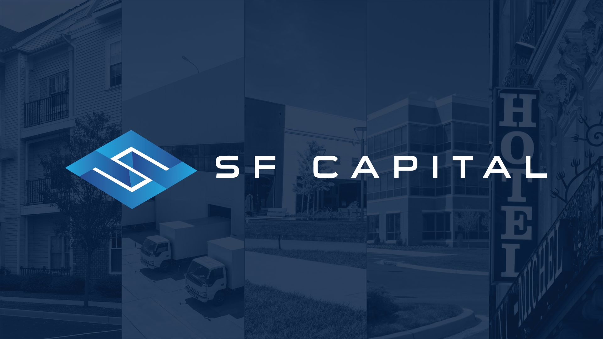
SF Capital Group
Visual Identity Refresh
SF Capital, the capital markets division of Friedman Real Estate, engaged in a strategic visual identity refresh to better reflect its role as a trusted financial partner operating at a national scale. While the firm’s services, leadership, and market focus remained unchanged, its visual presence needed to communicate greater confidence, stability, and institutional credibility across all client-facing materials.
I led the refresh to modernize the brand while preserving its recognition, ensuring that every touchpoint accurately represents the firm’s execution strength and commitment to positive financial outcomes.
I led the refresh to modernize the brand while preserving its recognition, ensuring that every touchpoint accurately represents the firm’s execution strength and commitment to positive financial outcomes.
The Challenge
As SF Capital’s deal volume, visibility, and influence grew, its existing brand system no longer aligned with its market position. Materials produced across teams lacked cohesion, and certain visual elements unintentionally conflicted with financial messaging.
Key challenges included:
• Inconsistent design across emails, social media, deal announcements, and third-party materials
• A color palette that included red, which carries negative financial associations
• Messaging that did not clearly convey certainty, stability, and disciplined execution
• No standardized system to guide future communications
The firm needed a refined visual identity that would reinforce trust, professionalism, and reliability for investors, lenders, and clients.
Approach
The refresh focused on evolution rather than reinvention, strengthening the brand’s foundations while improving clarity and consistency.
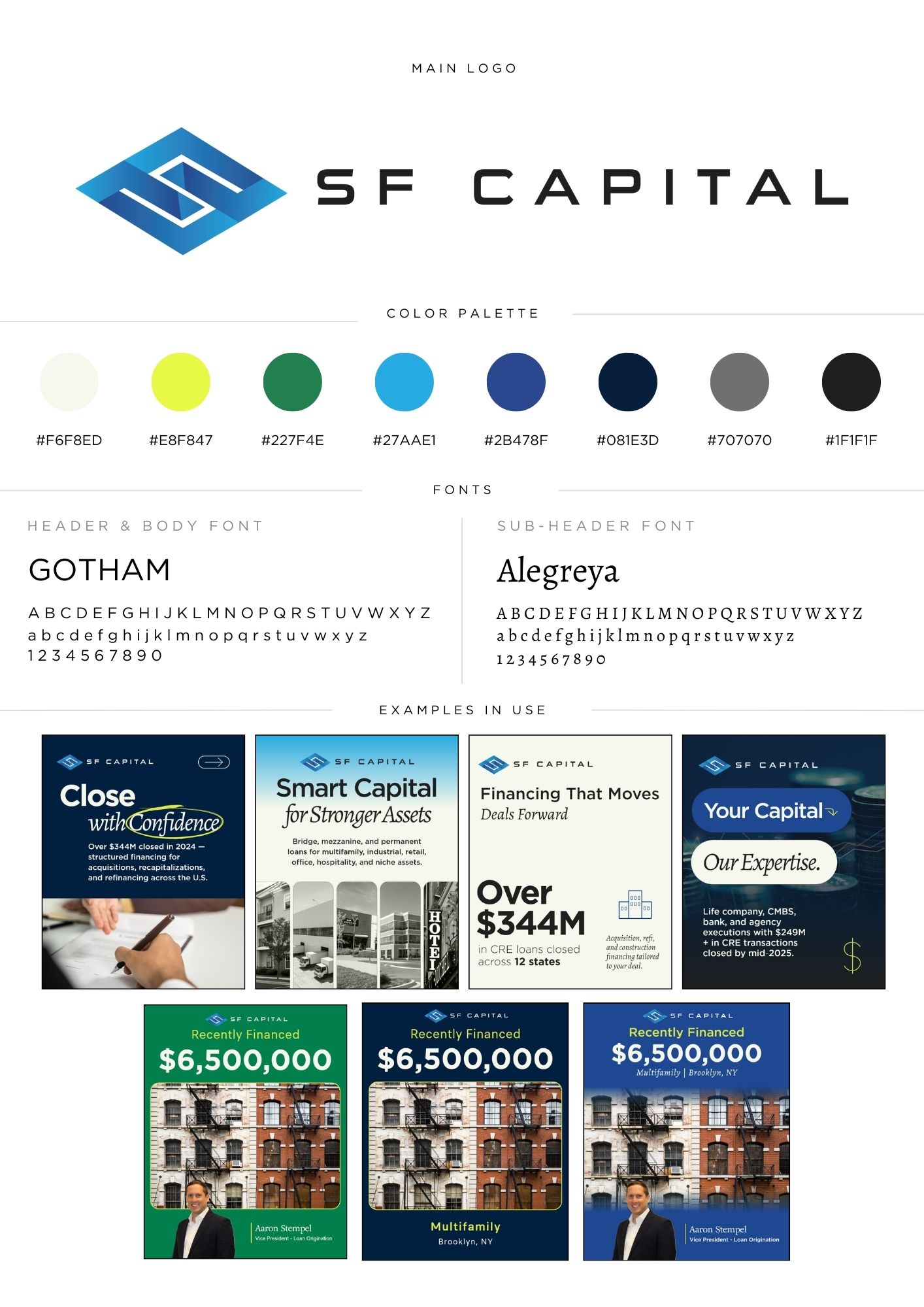
Strategic Color Refinement
Red was removed entirely due to its strong association with financial loss (“in the red”). The updated palette emphasizes:
-
Blues to communicate trust and professionalism
-
Greens to represent growth and positive outcomes
- Charcoal and neutral tones for institutional strength
Positioning Through Design
Visual standards were aligned with SF Capital’s core differentiators:
• Certainty of execution
• Strong lender relationships
• Risk mitigation and disciplined capital strategies
• Confidence in complex market conditions
The goal was to present the firm as a steady, outcome-focused partner rather than a transactional intermediary.
• Certainty of execution
• Strong lender relationships
• Risk mitigation and disciplined capital strategies
• Confidence in complex market conditions
The goal was to present the firm as a steady, outcome-focused partner rather than a transactional intermediary.
System-Wide Consistency
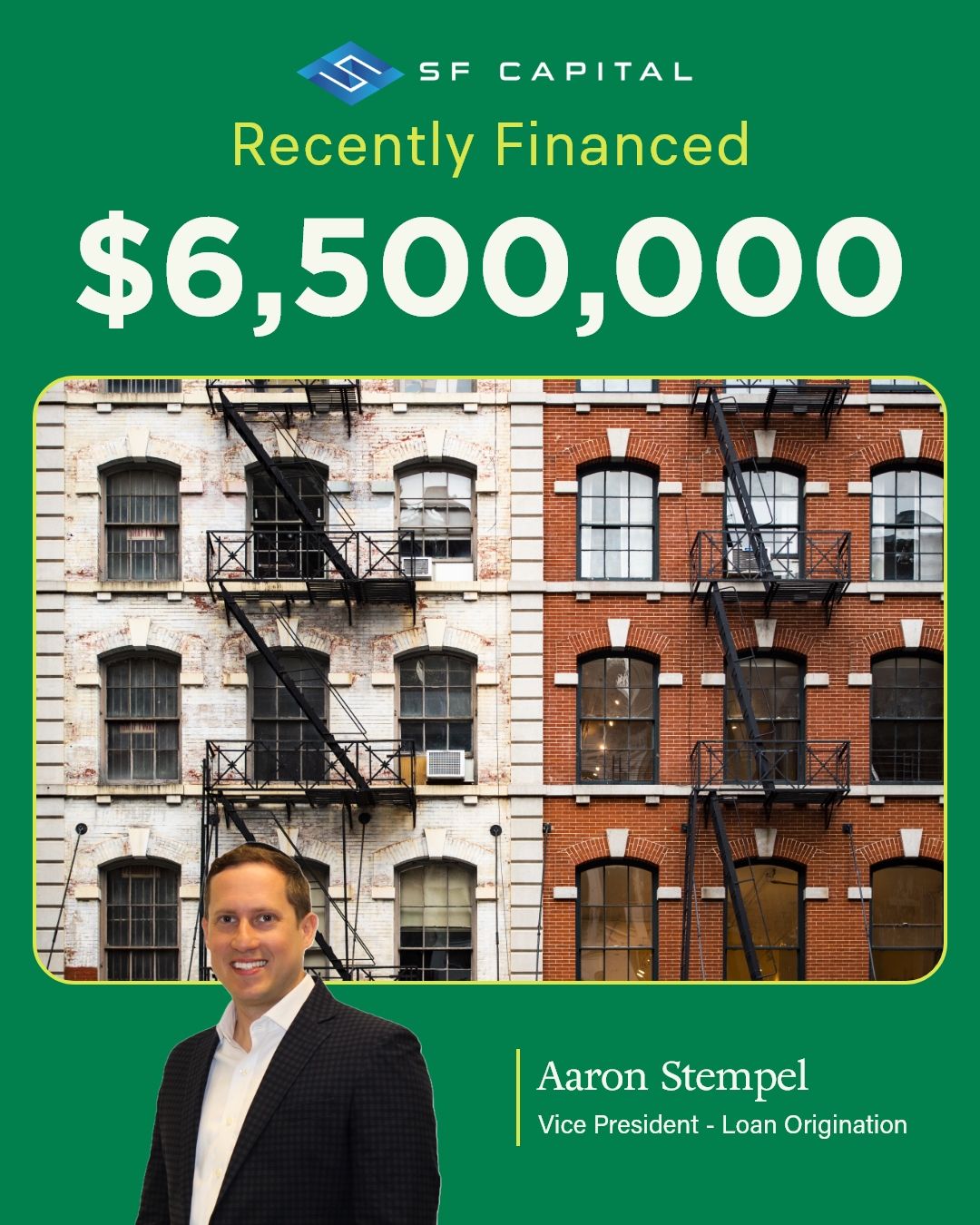
A unified design framework was created and applied across all key touchpoints, including:
This ensures every interaction communicates the same cohesive brand story.
-
Deal announcement graphics
-
Email marketing and thought leadership pieces
-
LinkedIn and social media assets
- Case studies and external materials
This ensures every interaction communicates the same cohesive brand story.
Solution
I developed a comprehensive brand guide and template system to support long-term consistency across teams and channels.
Deliverables included:
The new system balances clarity, credibility, and flexibility, allowing the brand to scale alongside the firm’s growth.
Deliverables included:
-
Refined logo usage guidelines
-
Updated color palette with red fully removed
-
Standardized typography hierarchy
-
Modular templates for deals, campaigns, and social content
-
Clear examples demonstrating correct application
The new system balances clarity, credibility, and flexibility, allowing the brand to scale alongside the firm’s growth.
Outcome
The refreshed identity delivers a cohesive, future-ready brand presence aligned with SF Capital’s performance and ambitions.
Results include:
Results include:
-
Elimination of negative financial connotations
-
Stronger perception of stability and trust
-
Improved consistency across departments and platforms
-
Scalable templates supporting increased deal activity
-
A visual identity that aligns with Friedman Real Estate’s broader brand ecosystem


Key Takeaway
A strategic visual refresh transformed SF Capital’s brand into a cohesive system that communicates stability, trust, and execution strength at every touchpoint.