
Eden Park Community Project
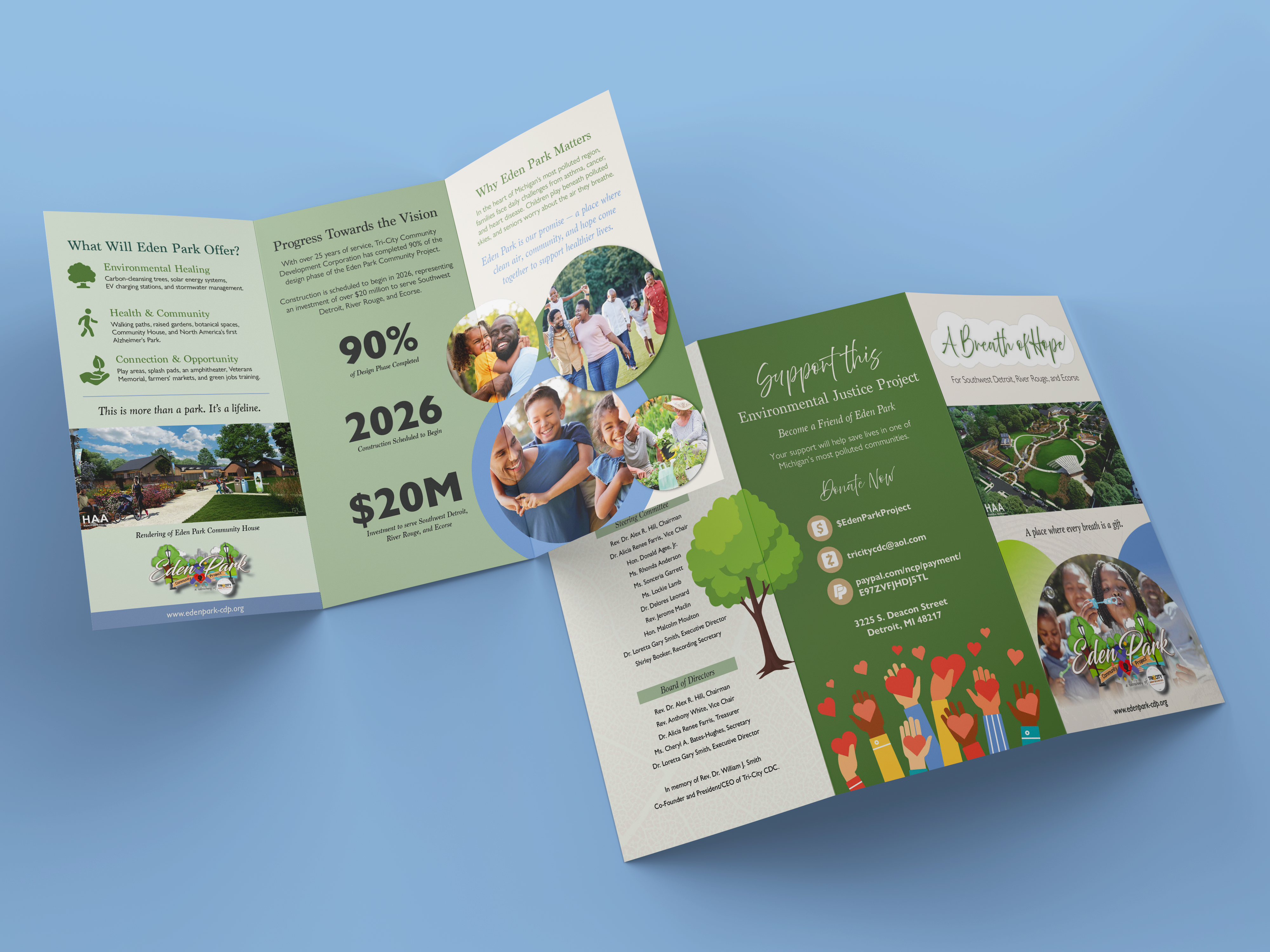
Flyer DesignThe Eden Park Community Project is an environmental justice initiative led by Tri-City Community Development Corporation, focused on transforming a former school site into a 5.7-acre green space for Southwest Detroit, River Rouge, and Ecorse. The goal of this project was to design a tri-fold brochure that clearly communicates Eden Park’s vision, progress, and community impact while inspiring trust, engagement, and donations.
Strategy & Approach
The design strategy centered on clarity, breathability, and trust.
Key decisions included:
The visual system intentionally avoided harsh contrasts or dense layouts, allowing the message to feel calm and hopeful.
Key decisions included:
-
Structuring content in a clear narrative flow: Why it matters → Progress → What’s coming → How to support
- Using a restrained, nature-inspired color palette to reinforce themes of healing and environmental restoration
- Pairing editorial typography with friendly iconography to balance credibility and warmth
-
Designing with print in mind, ensuring legibility, hierarchy, and fold-safe layouts
The visual system intentionally avoided harsh contrasts or dense layouts, allowing the message to feel calm and hopeful.
Design Solution
The final deliverable was an 11 × 17 tri-fold brochure, designed for community distribution, meetings, and fundraising events.
Key design elements:
The overall layout balances storytelling with information, guiding the reader naturally through the brochure.
Key design elements:
- A soft, inviting cover featuring the headline “A Breath of Hope” paired with a park rendering to immediately communicate the vision
- Interior panels organized into digestible sections with clear headings and icons
- A progress panel highlighting milestones (90% design completion, 2026 construction start, $20M investment) to build credibility
- A strong call-to-action panel encouraging donations and community involvement
-
Warm imagery featuring families, seniors, and children to humanize the impact
The overall layout balances storytelling with information, guiding the reader naturally through the brochure.
Visual Language
Outcome
The brochure provides Tri-City CDC with a versatile, professional marketing tool that:
This piece serves as both an informational asset and an emotional touchpoint, reinforcing Eden Park as a symbol of hope, health, and community resilience.
- Clearly communicates Eden Park’s mission and scope
- Builds trust with donors, partners, and community members
- Supports fundraising and outreach efforts
-
Aligns visually with the organization’s values and long-term vision
This piece serves as both an informational asset and an emotional touchpoint, reinforcing Eden Park as a symbol of hope, health, and community resilience.