
Crowned by Candace Beauty Collection Launch
Flyer DesignCrowned by Candace is a beauty brand built around confidence, self-expression, and feeling elevated in everyday life. For the launch of her new beauty collection, Candace needed a strong visual campaign to promote her Sip & Shop Beauty Event and introduce her new product line to customers in a way that felt polished, modern, and retail-ready.
The goal was to create marketing materials that felt luxurious yet approachable, helped communicate key event details clearly, and matched the energy of a real beauty brand launch rather than a simple pop-up sale.
The goal was to create marketing materials that felt luxurious yet approachable, helped communicate key event details clearly, and matched the energy of a real beauty brand launch rather than a simple pop-up sale.
The Challenge
Candace was launching multiple beauty products at once, including lip gloss, lashes, bonnets, mascara, and eyebrow gel wax. She needed:
This wasn’t just about sharing information. It was about creating excitement, urgency, and brand trust.
-
A flyer that looked professional and premium
-
Something that would stand out on social media and in-store
-
A design that matched her existing Crowned by Candace brand
-
Visuals that made the launch feel like a real collection drop
This wasn’t just about sharing information. It was about creating excitement, urgency, and brand trust.
The Strategy
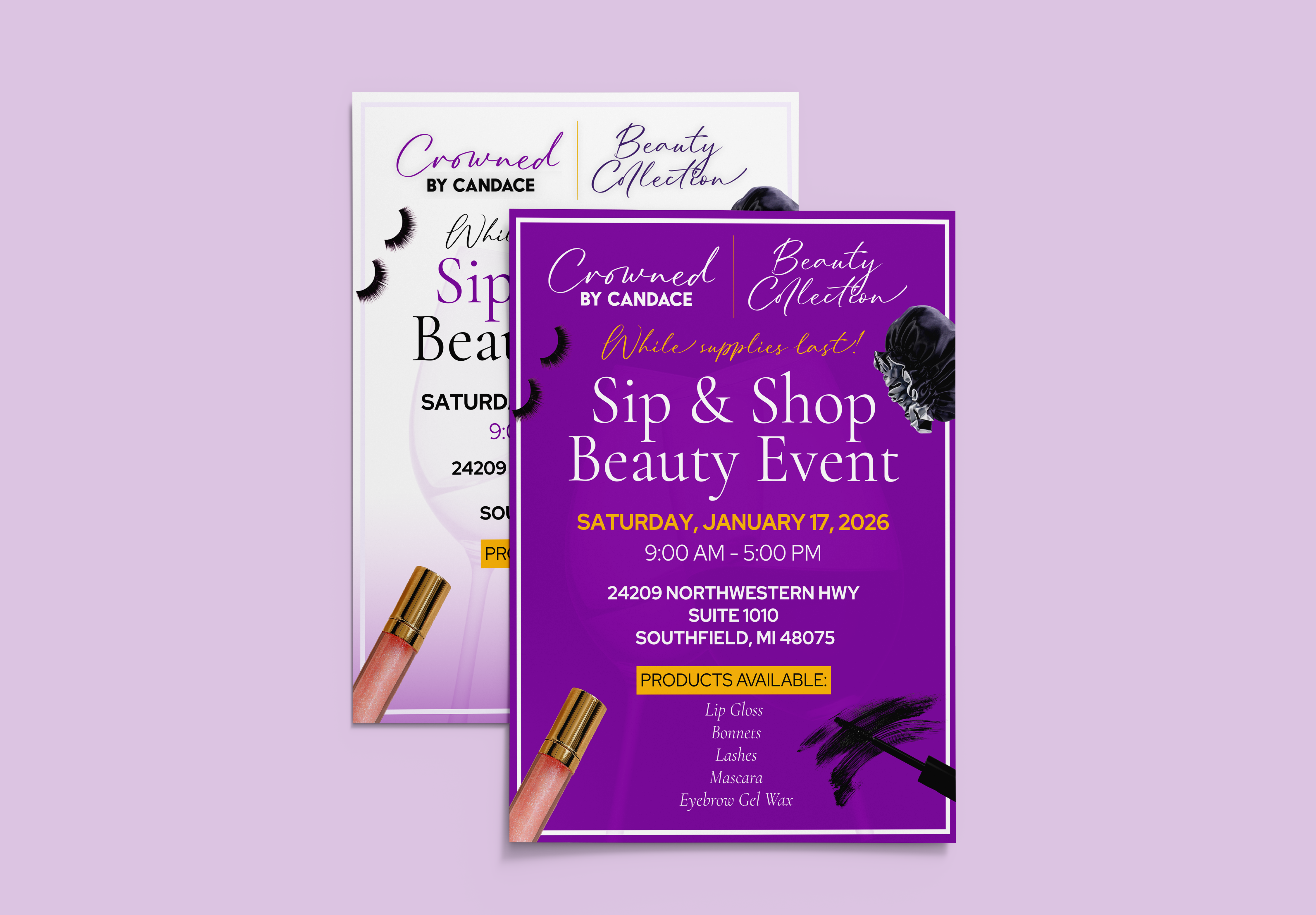
I designed two coordinated flyer styles to give Candace a full mini-campaign rather than just one static graphic.
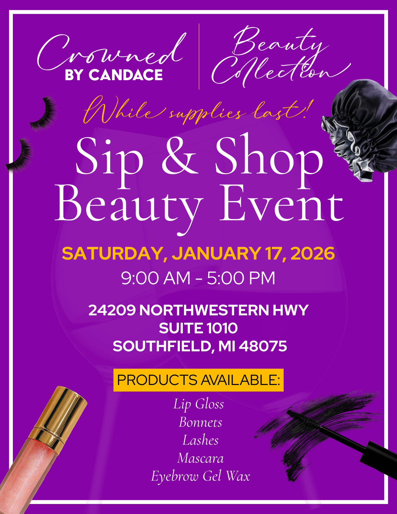
1. A bold purple version
This was created to grab attention and stop the scroll on Instagram and in Stories. The deep purple background, gold accents, and high-contrast typography were designed to feel powerful, glamorous, and high-impact.
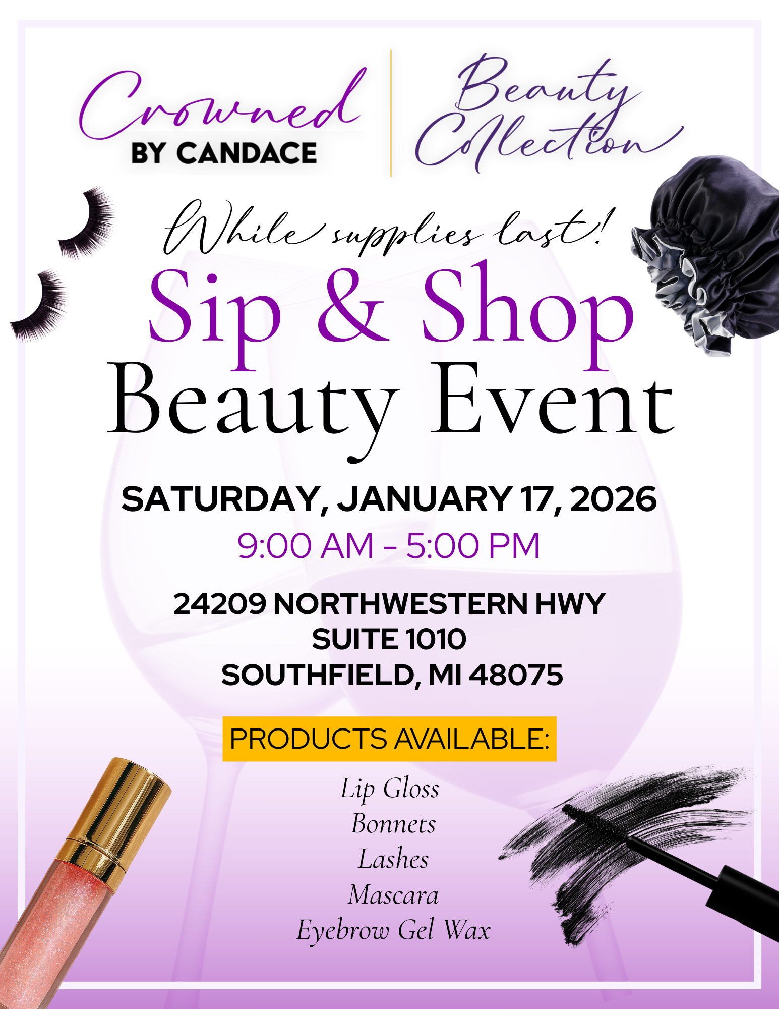
2. A clean white version
This version was designed for a softer, boutique feel. It works perfectly for email marketing, website placement, and in-store use. It makes the brand feel elevated and editorial, like a real beauty launch.
Together, these gave Candace flexibility to promote her launch across different platforms without losing consistency.
1. A bold purple version
This was created to grab attention and stop the scroll on Instagram and in Stories. The deep purple background, gold accents, and high-contrast typography were designed to feel powerful, glamorous, and high-impact.
2. A clean white version
This version was designed for a softer, boutique feel. It works perfectly for email marketing, website placement, and in-store use. It makes the brand feel elevated and editorial, like a real beauty launch.
Together, these gave Candace flexibility to promote her launch across different platforms without losing consistency.
Design Direction
The visual identity for the launch was built around:
Every element was designed to support the idea that this was a real beauty brand collection, not just a sale.
-
Pink, purple, and gold tones to reflect femininity, luxury, and confidence
-
Soft gradients and glow effects to create a modern beauty aesthetic
-
Product cutouts like lashes, gloss, and mascara to instantly show what was being sold
-
Script and serif typography to balance elegance with readability
Every element was designed to support the idea that this was a real beauty brand collection, not just a sale.
Deliverables
-
Event name
-
Date and time
-
Location
-
Product lineup
- Limited-supply urgency
The Result
Candace approved both designs and now has a polished, professional campaign for her beauty collection drop. The flyers give her brand:
The final designs elevate Crowned by Candace from a small business into something that feels like a real, established beauty brand.
-
A cohesive visual identity
-
A retail-level look
-
Marketing materials that feel ready for both digital and physical promotion
The final designs elevate Crowned by Candace from a small business into something that feels like a real, established beauty brand.